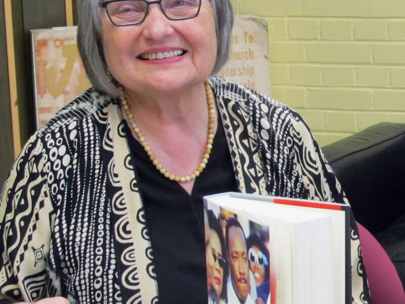
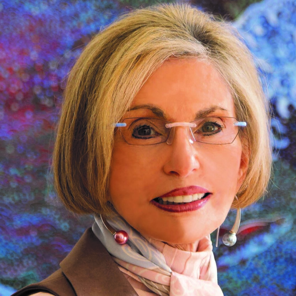
When Leatrice “Lee” Eiseman ’71 (Antioch College, BA in Psychology) was a little girl, she knew she had a natural talent for putting colors together to create something pleasing to the eye. Encouraged by her mother and aunt, she further developed her abilities, and today people around the world seek her expertise on the subject of color.
An internationally recognized color specialist, she is Director of the Eiseman Center for Color Information & Training and Executive Director of the Pantone® Color Institute. She has been quoted in and recognized by such publications as Fortune Magazine and the Wall Street Journal as one of the most influential people in the world of color, and she has written 10 books on the subject.
When Eiseman is not helping companies choose colors in brand imaging, design, fashion, and cosmetics, she is a sought-after speaker for trade shows, schools, in-house business presentations, and webinars. She offers training courses and classes on color trends, the psychology of color, and its usage. Eiseman is also instrumental in choosing the Pantone Color of the Year.
While Pantone’s Color of the Year has influenced product development and purchasing decisions in multiple industries, Eiseman said it’s the psychology of color that influences those decisions.
When she started as color consultant, she realized most people had little knowledge about color. “I’ve worked hard in this field to educate people about the importance of color,” she says.

Eiseman was instrumental in choosing the Pantone Color of the Year, which is celebrating its 20th anniversary. The color chosen for 2019 is Living Coral.
“It conjures images of coral reefs, where fish go for nutrients. Reefs are disappearing and we are in danger of losing them. It’s important and we feel strongly about it,” Eiseman says. This year’s Pantone color is also a response to the desire for authentic experiences in the onslaught of digital technology and social media. “We are living in an era of consternation in the world around us. We need reassurance and warmth and this warm shade suggests comfort and positivity.”
She stressed that her color consult is never meant to be dictatorial. “It’s not a political choice or about pleasing your manager. It’s a more objective view, about what feels like the right choice for your company,” she says. She noticed, this idea comes more naturally to women.
“Men didn’t know color was necessary, unless you talked to them about it from a pragmatic business standpoint,” she says. “I needed to explain to them within the context that color of a product, its box and advertising—all can have either a subliminal or obvious effect on the eye of the viewer. If they invested a lot of money in the development of a product, color is a large part of the presentation, of the messaging you want to get across. It’s a science as well as an art. When you explain it on that level and also from a symbolic or psychological standpoint, people can relate.”
It all starts with childhood associations with colors. “If you were fearful of snakes as a child, the color green might be scary to you. Children react on a visceral level,” she says. “On the flip side is a positive association. You might love the color red because it was the color of your first tricycle. It’s the color of independence. All those things you store, that’s what I delve into.”
It was that human connection to color, about why and how we choose color that made her realize studying psychology would help her gain greater understanding of color. “Antioch really gave me a firm direction to bring that ability to focus and know I had that as my goal. For me it was a great move,” Eiseman says.
While perceptions about colors can be formed early on in our lives, Eiseman believes they can also change. Take the color brown, for instance. Brown at one point was considered a dull color, but during the ’90s, that attitude began to switch.
“It became associated with tones of wood, like the wood of a beloved maple armoire, or of coffee or chocolate,” she says. “Then there was a Starbucks on every corner. Chocolat was a beloved movie. Brown became the color of rich soil, something of beauty. We saw a ground swell movement of change. People were inspired. Designers used brown in their runway garments. Brown diamonds became popular. It was a domino effect.”
She offered another example, when the color yellow was considered to be undesirable. “Twenty years ago, a so-called color consultant said yellow was bad for nursery walls because the color made babies cry,” she says.
Yellow is one of Eiseman’s favorite paint shades and features prominently in her home on Bainbridge Island, where the skies tend to be gray a lot of the year. “Yellow simulates sunlight. It’s cheerful and happy,” she adds.
Eiseman feels there is a new respect for color knowledge today.
“Color has an influence on so many parts of our lives. We have to stop to think about all the implications it has,” she says. “I applaud anyone who comes to me for that special help. I always love the challenge of helping my client make a better decision.”